• Branding
  • Design
  • Development
Visit the site
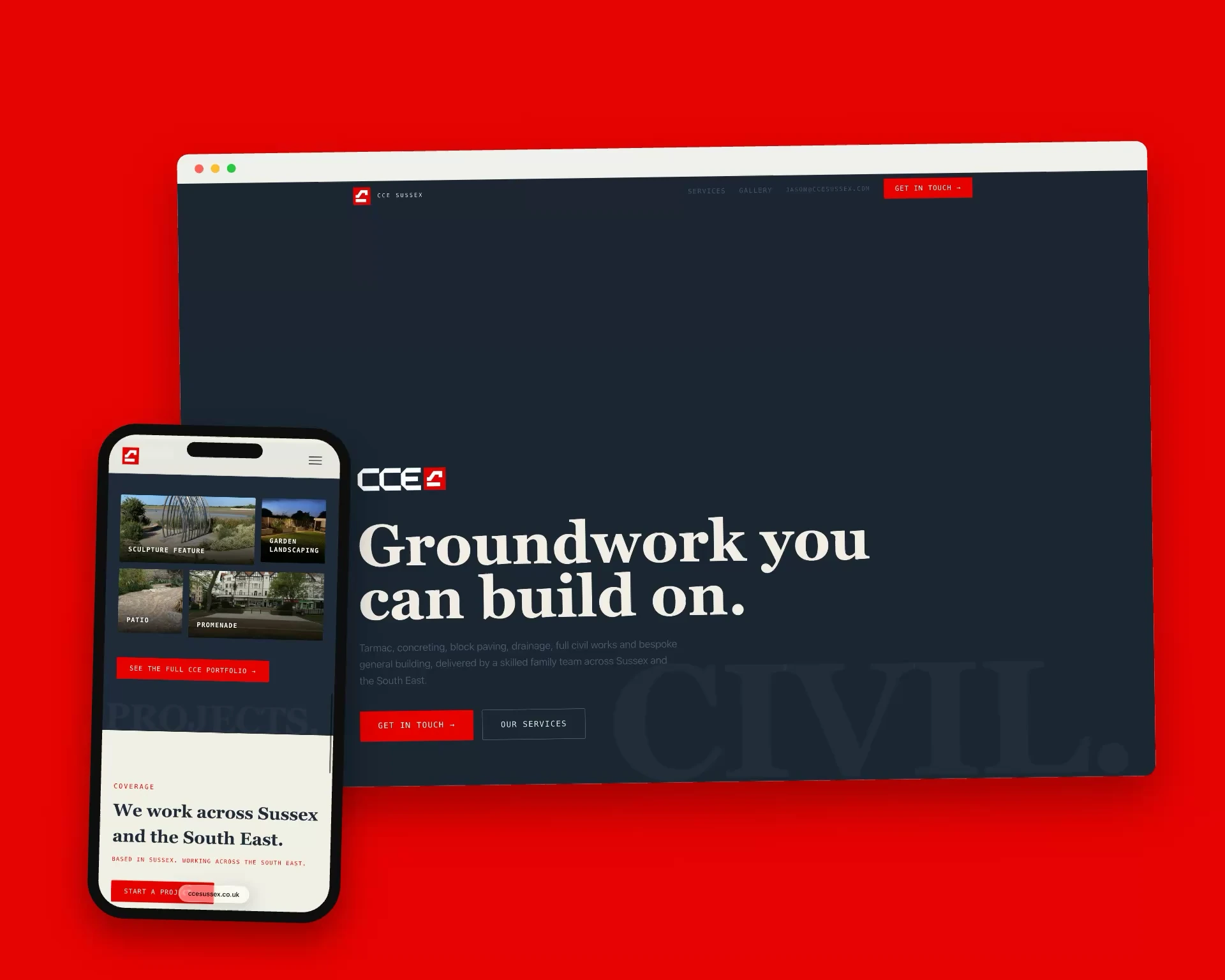
CCE Sussex website shown on a laptop and a phone
The client
Civil engineering and building
Where
Sussex, working across the South East
What we did
Branding, Design, Development
Year
2026

The brief

A family run civil engineering and general building contractor working across Sussex and the South East.

CCE Sussex is a family business with more than thirty years of consultancy and groundwork behind it. It covers tarmac, concreting, paving, drainage, footings and general building, from a single footpath to a full construction road.

They had the experience and the reputation, but almost nothing to show for it online. So we started with the identity, giving them a proper brand and mark, and then built the website around it.

Design approach

The family had no proper logo, just red “CCE” text. They had been thinking about changing it for a while and asked us to rebuild everything, so the brand came first and the site was designed around it. That let us build a full intro animation into the site, which we haven’t seen anywhere else in that industry. They went on to use the new logo for everything: clothing, high vis, trousers, hats, beanies and invoices. The main design choice is the service tiles in the centre. When you press one it moves to the middle of the screen, so the eye has nowhere else to go but the services. The ghost marks were Jude’s own addition, partly a test to see how they’d work, and the gallery is there to show the work. We avoided the usual tiles, scroll, tiles, scroll pattern for this industry. We had a lot of creative freedom and used it, and the enquiry form just does what it needs to.
What we built

  1. A brand and a mark

    A wordmark and a square red mark, set against deep navy. Red is used sparingly, for the logo, the calls to action and the small labels.

  2. An intro that builds the logo

    The site opens on the red mark alone on navy. The letters unfold beside it, the line Civil engineering and general building contractors fades in, and then the page opens.

  3. A headline like a poster

    A huge serif headline, Groundwork you can build on, with a giant ghosted word sitting behind it. The same device comes back behind the photography.

  4. Services you drag through

    Nine services sit in a row of tiles that you drag sideways and click to open, with a plain list on a Services page for anyone who would rather read.

  5. Proof in photographs

    A portfolio of more than fifty projects, from driveways and patios to foundations, drainage and a footbridge. The best sit as a mosaic on the home page and all of them are on a Gallery page.

  6. A family firm, said plainly

    The copy sounds like the people: a local family business, no middlemen and no salesmen, with a strip of four quick facts under the headline.

The look

  • Navy#1F2A3A
  • Signal red#E80101
  • Cream#F2EFE7
  • Slate#4F5E74
  • Playfair DisplayHeadings
  • OverpassBody text

In their words

… Has transformed our businesses online presence with a website that’s slick and professional.

Jack MartinCCE Sussex · Google review
Read the whole review

Great website design, extremely knowledgeable and easy to deal with. Highly efficient at fine tuning all the small details with a keen eye for perfection. Has transformed our businesses online presence with a website that’s slick and professional.

Next case studyDental Growth LabRead it

All case studies

Want one like this?

Tell us what you need and we’ll come back with a quote.

Or email webdev@judepotter.net

Pop your email in first. We’ll ask a couple of quick things after, and you can stop whenever you like. This saves as you go, so you can pick up where you left off.

Step 1 of 4

Only used to reply to you. Saved as soon as you press Say hello.
Now booking for 2027. Secure your spot.. Get in touch